Social Video Aspect Ratios and Safe Areas Explained
Compare video aspect ratios for social media, resolution and vertical safe zones. See three framing studies, dated platform specs and checks before you upload.
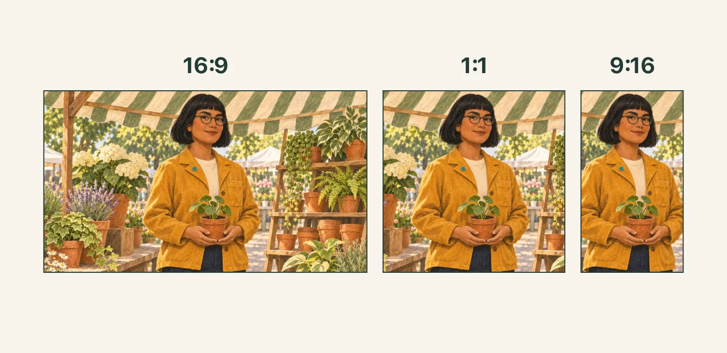
Choose video aspect ratios for social media before you generate the clip. A plant seller's face, the pot in her hands and the space for a later caption all compete for the same frame. A landscape image can show the whole stall while a vertical crop cuts away most of it.
We checked YouTube's Shorts guidance, TikTok's in-feed advertising specifications and the site's current video settings on 2 November 2026. The source artwork was made with an AI image tool, and the three crop windows use exact geometric proportions. These are static planning images, not frames from a video-generation test.
Social video aspect ratio vs resolution
An aspect ratio compares width with height. 9:16 is taller than it is wide; 16:9 is wider than it is tall. 1:1 has equal sides. The order matters.
| Shape | Example pixel dimensions | What the frame gives you |
|---|---|---|
Landscape 16:9 |
1920 × 1080 | Room for a person, a counter and the surrounding stall |
Square 1:1 |
1080 × 1080 | A compact view of the face and the object being held |
Vertical 9:16 |
1080 × 1920 | More height for the person, with less room beside them |
These dimensions illustrate the arithmetic, rather than a guaranteed export option. A 720 × 1280 file and a 1080 × 1920 file are both 9:16. Changing from the first to the second adds pixels without changing the shape. A model's label such as 2K is not enough to establish the exact width and height of the downloaded file.
Stretching a landscape file into a vertical rectangle makes the person look narrow. Cropping removes part of the picture. Fitting the full picture inside a vertical canvas leaves unused space around it. Choose the treatment deliberately in your editor.
Compare what survives each crop

You can open the full crop comparison or source illustration to inspect the edges. In the landscape study, the stall helps explain where the woman is. The square version removes most side shelving while keeping the face and pot together. The vertical version makes the person prominent but gives the shelving much less space. Check the hand at each side of the pot, not just the face.
A centered vertical crop from a landscape 16:9 frame keeps about 32 percent of its original width when the height stays the same. Two people near opposite edges are unlikely to fit. That is a reason to plan a separate vertical composition before generation, particularly when both people matter to the story.
Give a moving subject room inside the intended crop for the entire shot. A person can start comfortably centered and end underneath an interface button. A camera move can also bring a hand or product toward an edge. Check the beginning, middle and end after the video is generated.
Read the rule for the actual placement
The following is a dated reference, checked on 2 November 2026. Advertising requirements apply to their named ad format; they do not establish the upload rules for every ordinary post.
| Official placement | Published shape or size rule | Scope |
|---|---|---|
| YouTube Shorts | Square or vertical, up to three minutes, for standard channels' uploads on or after 15 October 2024 | Ordinary Shorts classification |
| TikTok Non-Spark in-feed ads | 9:16 at least 540 × 960; 16:9 at least 960 × 540; 1:1 at least 640 × 640 |
This specific advertising format |
YouTube's guidance allows square Shorts as well as vertical ones. A full-height vertical composition can still be your creative choice. The platform's maximum length does not mean your selected AI model can generate that length.
TikTok's in-feed ad specifications describe safe zones that change with the dimensions, caption length and additional formats. Use the matching official template and current placement preview for an ad. A template saved for a different caption or format can leave the wrong space clear.
Check vertical video safe zones with the interface visible
A safe area protects important content from controls and display treatments. A subtitle area is where you intend to put your own text. A subtitle can sit well inside the video file and still be covered by a platform caption or action rail.
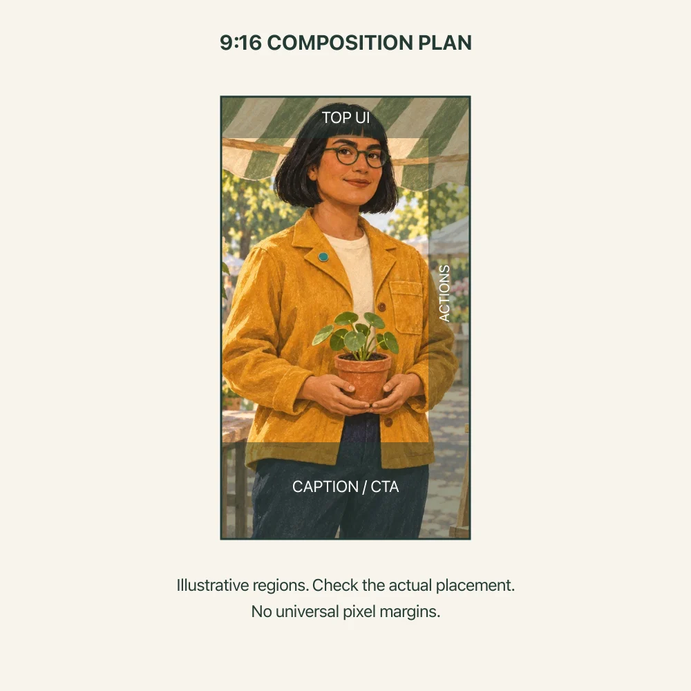
The shaded areas in this drawing are a planning reminder, not a measured platform template. They deliberately have no universal pixel allowance. Check the actual app or advertising preview before deciding how close a face, hand or caption may sit to an edge.
For the plant scene, keep the face and both hands away from the right-hand controls. Leave a quieter patch of background for subtitles that will be added later. Do not place the pot at the very bottom just because the still image looks balanced without a user interface.
If the text needs two lines, preview two lines. If an ad has an extra call-to-action treatment, include that treatment in the preview. A clean still preview with those elements absent cannot show whether the final layout fits.
Choose the supported shape in AI Media Generator
Open the AI video generator, select a model and open its settings. On 2 November 2026, the visible MiniMax H3 controls included 16:9, 9:16 and 1:1, alongside other choices. The same panel separated aspect ratio, duration and resolution. Other models can offer a smaller set, so read the panel again after switching models.
For a vertical version of this scene, a prompt could say the following.
A single continuous shot of an adult plant seller holding one terracotta pot at waist height. Keep her face, both hands and the complete pot comfortably inside the central composition. Leave simple background around the upper sides and below her hands for later layout. Small natural hand movement, no camera pan, no generated text or logos.
Select 9:16 in the available settings as well as describing the composition. The prompt gives a framing intention. Add accurate subtitles in an editor, then check those subtitles and the exported framing in the intended publishing interface.
If you start with an image, first decide whether its existing framing has enough room. A tightly cropped face cannot supply a visible pot that lies outside the source picture without newly generated content. Our video input comparison helps choose the starting mode. The camera movement guide explains how a pan differs from moving the subject.
Check the file you will actually upload
Read the downloaded file's width and height. Preview it in the destination's draft or ad preview, with the intended caption and controls visible. Watch through the movement, especially when the hands or camera change position. Check subtitle line breaks at phone size.
If something is covered, revise its position in the edit or generate a composition with more room. Re-export, then preview that new file. Keep the clean version without interface overlays as your upload master.
Sources and image notes
- YouTube Shorts eligibility
- TikTok in-feed ad specifications and safe-zone files
- Current video controls
Checked on 2 November 2026. The character and market artwork is original and AI-generated. The crop comparison clips that same artwork at the proportions shown. The interface diagram adds illustrative regions and is not an official safe-zone template.