How to Fix Misspelled Text in AI-Generated Images
Fix misspelled text in AI images with three lettering comparisons, focused correction prompts and a clear stopping point for external typesetting.
To fix misspelled text in AI images, first write down the exact lettering you need. Compare the downloaded image with that text, then decide whether a focused edit is worth another generation. A short headline on a plain background is a different task from a poster containing dates, prices and several paragraphs.
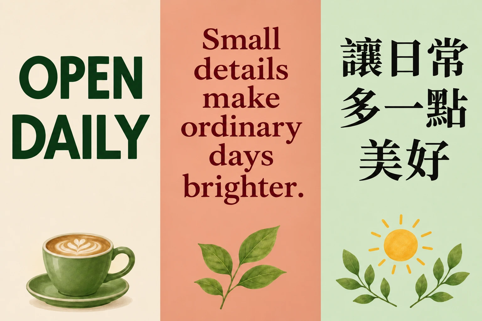
We checked Google's image-prompting guidance, Adobe's documented text limitations and the site's reference-image workflow on 3 November 2026. The three pairs below preserve specified lettering to repair on the left and checked target lettering on the right. They let you inspect individual corrections without treating the pictures as a model-accuracy score.
Separate AI image text spelling errors from layout errors
A spelling error changes the content. A layout error can leave every letter correct while making the sentence difficult to read. They need different instructions.
| What you can see | What to ask for | What to inspect afterward |
|---|---|---|
| An extra or missing letter | Replace the exact incorrect string with the exact target | Read every character, including repeated letters |
| A repeated word or character | Specify the complete final line and its word or character count | Check that the remaining words have not changed |
| Text clipped by the edge | Reduce the text block or enlarge its clear space | Read the first and last letter of every line |
| Correct letters in a crowded layout | Use fewer words, fewer text blocks and a simpler hierarchy | Check reading order at the final display size |
Higher resolution can make an error easier to see. It does not turn an incorrect word into a correct one. Decorative outlines, curved lettering and a busy background also make human proofing harder, even when they look good at thumbnail size.
Three lettering corrections to check character by character
Short English headline
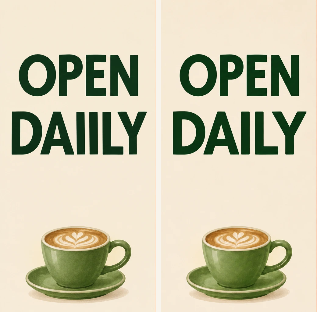
The left version reads OPEN DAIILY. The target is OPEN DAILY, with five letters in DAILY. The extra I is easy to miss because the adjacent vertical strokes look like part of the font.
Use a complete replacement instruction rather than “fix the typo.” For example, ask to replace OPEN DAIILY with OPEN DAILY, keep two centered lines, and preserve the cup artwork. Then read the full heading again. A corrected second line is not enough if the first line changed too.
Longer English sentence
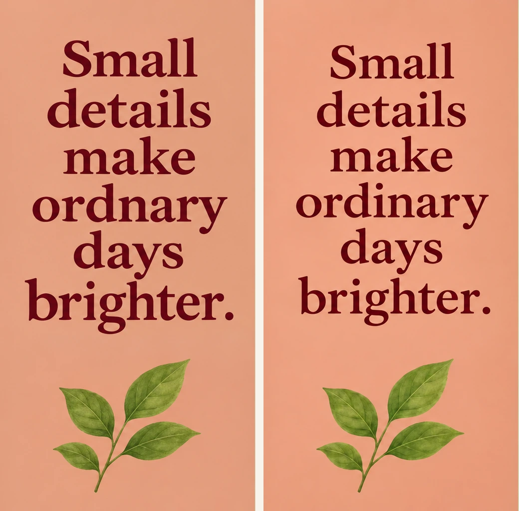
The intended sentence is Small details make ordinary days brighter. The source lettering drops the i from ordinary, producing ordnary. The corrected word has eight letters, and the complete sentence has six words.
The right poster also changes the text's size and spacing slightly. That matters. A request to preserve a design can still produce a different layout. Inspect the line breaks, margins and leaf artwork as well as the repaired word.
If the longer sentence keeps becoming cramped, choose a shorter approved line such as Small details. Brighter days. It changes the copy, so obtain the copy owner's agreement when working on a client's design. Reducing text is a layout decision, not proof that the original sentence cannot be generated.
Traditional Chinese lettering
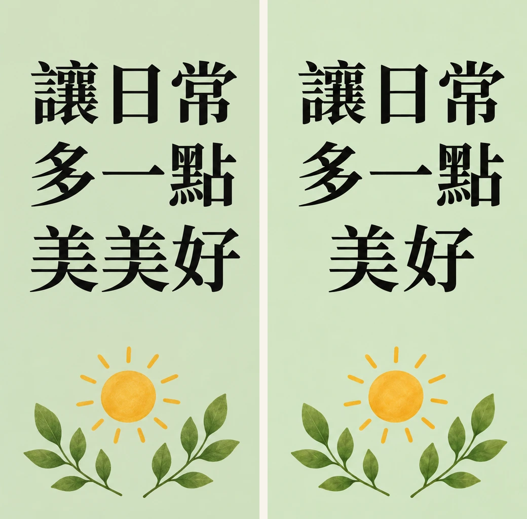
The left version contains 讓日常多一點美美好. The target 讓日常多一點美好 has eight characters. Remove one 美, then check that 讓 and 點 remain Traditional Chinese. An attractive glyph with a missing stroke can still be wrong.
Keep the target text in a plain-text note beside the image. Count the characters and read them in order. For unfamiliar languages, ask a fluent reader to proof the final export; visual resemblance is not a spelling check.
Replace incorrect lettering in generated images with a focused prompt
Open the AI Image Generator, sign in, and attach the image as a reference. Choose a model that accepts image input. The checked page showed Nano Banana 2 · Ext as the current selection, while other listed models such as Imagen 4 were text-only. A model name on a list does not give every model the same editing controls.
Give the location, the complete target string and the parts to preserve. This is a usable instruction for the short headline.
In the upper part of the reference poster, replace the heading with exactly “OPEN DAILY”. Use two centered horizontal lines, OPEN above DAILY. Keep the green cup, cream background and existing color palette. Remove other lettering from that heading area. Keep all five letters in DAILY clear and separate.
For the Chinese version, write the desired script directly.
將上方字樣改為「讓日常多一點美好」,共八個字,使用繁體中文。依序排成「讓日常」「多一點」「美好」三行。保留葉片、太陽和淺綠色背景,不新增其他文字。
Download the original and candidate separately. Compare them side by side instead of judging from memory. The same keep-and-change discipline used for recoloring one object is useful here, although a reference edit still cannot promise that every surrounding pixel stays fixed.
Set a stopping point before spending more credits
A short isolated heading is a reasonable candidate for a focused retry. A dense price list, a long address or several languages usually creates more proofing work. For a deadline, decide in advance how many revisions you can afford. Two focused candidates can be a practical working limit for one draft; that is a budget choice, not a predicted success rate.
After the first revision, identify the exact remaining problem. If only the margin is wrong, ask for the margin change. If a different word becomes wrong on each attempt, move the accurate copy into an external text layer. Do not keep increasing the request to include more decorative type, symbols and small print.
Google's prompting guide acknowledges occasional misspellings and difficulties with complex typography. Adobe separately documents text irregularities in its Firefly Text to Image feature. Those are product-specific statements. They do not establish a failure rate for all models offered here.
Put must-be-exact copy into an external text layer
For a shop address, date, price or required wording, prepare artwork with a clear text area and typeset the approved copy separately. Downloading a PNG or WebP does not turn its existing letters into editable text objects.
Photopea's documented workflow is one option for that external step.
- Open a text-free version of the artwork. If the old heading remains, remove it first or cover the entire text area with an intentional solid panel on a suitable flat background. Typing directly over old letters leaves fragments behind.
- Select the Type tool. Click for a short line, or drag a paragraph box for a longer passage.
- Paste the approved copy from your plain-text note. Choose a font with the required glyphs, then set size, spacing and alignment.
- Inspect the text at 100 percent and at the intended delivery size. Check for missing glyphs, clipped edges and confusing line breaks.
- Save a PSD to retain the editable structure. Export a PNG or JPG for delivery and read that exported file again.
The external step costs some layout time, but changing one letter afterward no longer requires regenerating the artwork. It also gives a copy owner something concrete to approve.
A final proofing pass before delivery
Read from the image, not from what you expect it to say. Check the headline, punctuation and capitalization; then inspect numbers and repeated characters separately. OCR can help locate text, but a plausible OCR transcript does not prove the image itself is correct.
Look at the final crop on a phone. Every character may be present while the last word sits outside the visible area. Keep the approved copy, original artwork and editable file together. This lettering proof sheet includes the three target strings and focused correction prompts for reuse.